TLDR;
This video provides a tutorial on how to practice italic calligraphy, a classic and versatile style. It covers the necessary supplies, proper pen angle, and step-by-step instructions for forming lowercase and uppercase letters. The video emphasizes the importance of mastering basic strokes and letterforms before adding embellishments.
- Proper pen angle is crucial for achieving the characteristic thick and thin strokes of italic calligraphy.
- Mastering basic letterforms is essential before adding flourishes and embellishments.
- Practice and patience are key to developing proficiency in italic calligraphy.
What is Italic Hand [0:00]
The video introduces italic calligraphy as a standard and classic style that is both elegant and versatile. It is presented as a style that can be self-taught and combined with other calligraphy styles. The instructor uses layout bond paper, along with a guide sheet, and Higgins Eternal ink for the demonstration. Reference materials, such as the Speedball textbook and "Lettering and Calligraphy Workbook," are recommended for practice. If books are unavailable, online resources for italic alphabets can be used as references.
Supplies and tools [0:33]
The instructor uses layout bond paper, along with a guide sheet. Also, Higgins Eternal ink for the demonstration. Reference materials, such as the Speedball textbook and "Lettering and Calligraphy Workbook," are recommended for practice. If books are unavailable, online resources for italic alphabets can be used as references.
About the pen angle [2:00]
For italic calligraphy, the pen should be held at a 30 to 45-degree angle. To find the correct angle, imagine dividing a 90-degree angle in half to approximate 45 degrees. Practice creating thin lines at this angle, combining them with straight downstrokes at a slight slant (e.g., 5 degrees). Mastering these basic strokes is essential before moving on to writing full letters. The nature of the pen automatically produces two strokes depending on the direction, making italic calligraphy beginner-friendly.
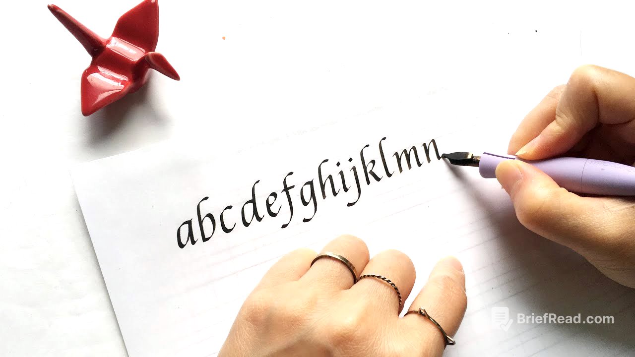
Lowercase a-i [3:35]
The instructor demonstrates how to write lowercase letters from a to i. For the letter "a," the horizontal top bar is created first, followed by the downstroke. The letter "b" involves a straight downstroke with a curve, which can be done in one or two strokes. Variations for "d" include adding a small roof. The letter "e" is similar to "c" but with an enclosed counter. Simple and clean forms are shown for "f," with an optional swash. The letter "g" is like "a" with a downstroke and swash, and "h" can have a small loop. The letter "i" is completed with a diamond-shaped dot.
Lowercase j-r [6:40]
The instructor continues demonstrating lowercase letters, starting with "j," which is an extension of "i." Several variations of "k" are shown, including a clean version and one with a loop. The letter "l" is a simple stroke, while "m" is formed with two arches. The letter "n" is similar to one arch of the "m." The letter "o" is created with a rounded stroke, and "p" can be simple or have an over-the-top stroke. The letter "q" is similar to "a" with an added line, and "r" resembles an "i" with a small tail.
Lowercase s-z [8:51]
The instructor proceeds with the remaining lowercase letters. The letter "s" is described as challenging, involving a squiggly line with additions at the top and bottom. The letter "t" can have the top part filled in. Simple forms of "u" and "v" are shown, with "w" being a double "v." Variations of "w" include a "magic W." The letter "x" can be formed with two back-to-back "c" shapes. The letter "y" can be done in a new style or freestyle, similar to "g." Finally, "z" is created with a crossbar.
Uppercase A-I [11:50]
The height of capital letters is typically between seven and a half nib widths high, slightly below the ascender line. The pen should be held more flat, around a 20-degree angle. Capital letters consist of many straight lines, requiring a steady hand. The basic forms are demonstrated without embellishments. Letters like B, D, P, and R, which have larger curves, are more challenging.
Uppercase J-R [13:43]
The instructor continues with uppercase letters, noting that "K," "L," "M," and "N" involve straight lines. The letter "N" is considered one of the hardest due to its need for symmetry. The letter "O" is difficult because it needs to appear slanted and well-rounded. The letter "P" can easily look like it's tipping over if the top is too thick. The letter "Q" is like "O" with a tail, and "R" resembles a "P" with a leg that is hard to get right.
Uppercase S-Z [15:39]
The instructor concludes with the remaining uppercase letters. The letter "S" is less curvy than its lowercase counterpart. The letters "T" and "U" are relatively simple, involving straight lines. The letters "V," "W," "X," "Y," and "Z" are then demonstrated to complete the alphabet. The instructor encourages viewers to try italic calligraphy and to add flourishes once they are comfortable with the basic letterforms.