TLDR;
This video explores a whimsical yet surprisingly scientific investigation into which typeface's capital "I" makes the best I-beam. The creator details the journey of testing various fonts, initially focusing on bending but expanding to buckling, tension, and torsion. Through physical experiments and finite element analysis, the video reveals that while traditional I-beams perform well, certain fonts like BioRhyme can outperform them. Ultimately, the investigation broadens to the entire alphabet, identifying O's, D's, and rotated H's as superior structural letters, challenging the conventional use of "I" in I-beams.
- Explores the structural properties of different fonts when used as I-beams.
- Combines physical testing with finite element analysis for comprehensive results.
- Expands the investigation to the entire alphabet, identifying optimal letterforms for structural applications.
Abstract [0:00]
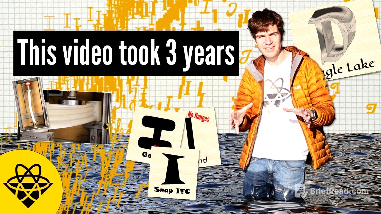
The video starts with the question of which typeface's capital I makes the best I-beam. The creator shows examples of I-beams made from different fonts, including one from the Disney logo. The creator mentions building bridges, printing pamphlets, and running simulations using 1,000 fonts to determine the best letter for typography-based civil engineering.
Literature Review [0:40]
The video discusses the history of typography, starting with Johannes Gutenberg's printing press in 1440, which used a black letter font based on handwritten Bibles. This font, while visually appealing, was not very legible. Nicholas Jenson later introduced Roman type in 1470, based on Roman carvings, which greatly improved readability. Printing presses spread across Europe, leading to the development of various fonts for different purposes, including readability, geometric form, and artistic expression.
The mechanics of I-Beams [2:15]
The video explains the mechanics of I-beams, contrasting simple beam bridges made from large pieces of material with more efficient designs using less material. It describes how a regular profile experiences bending when a load is applied, with compression at the top and tension at the bottom. The failure of a material is due to its atomic structure, where tension pulls ions apart and compression pushes them too close, causing buckling. The optimal solution is to concentrate material in the upper and lower flanges to resist deflection. I-beams are typically produced by hot rolling structural steel.
Mechanical methods [4:28]
The video details the mechanical methods used to test the I-beams made from different fonts. Initially, 3D printing was considered, but it only indicated layer-by-layer bonding strength. Instead, a four-axis CNC router was used with blocks of HDPE plastic to produce six beams. The fonts were scaled to fit within a 12-by-12-centimeter area. The most important result was the load carried versus the mass of material used. An Instron machine with a custom heavy-duty mount was used to perform the testing.
Breaking Beams [5:50]
The video describes the process of breaking the beams to test their strength. The traditional I-beam bends, buckles, and eventually breaks. The stress-strain data shows the load increasing in an arc before reaching an ultimate strength of 16,000 newtons. The Google font Kablammo, with more flanges, survived to almost 26,000 newtons. Arial Black, a straight-line I, reached 20,000 newtons. In buckling tests, San Francisco reached 4,000 newtons, while Times New Roman reached 24,000 newtons before breaking.
Finite element maddness [7:10]
The video explains the use of finite element analysis to simulate the bending moment of inertia of different beam profiles. This method breaks down complex shapes into thousands of individual points connected by springs. The creator wrote code to automate this process, spending seven days writing the code and two days running the simulations. The results were plotted with mass on the x-axis and load on the y-axis, comparing Instron bending tests with simulation data. The traditional beam had the greatest load capacity for the lowest mass. Simulations showed that Kablammo's outer flanges were more effective than the inner ones.
Alphabet soup [9:41]
The video expands the investigation to the entire alphabet, examining bending, buckling, tension, and torsion. The worst typeface was Zapfino, while the best was Courier New, performing almost identically to a regular I-beam. Rotated H's performed better than regular H's and I's due to flanges in the top and bottom. O's and D's dominated in buckling tests. Tension tests showed everyone performing the same. In torsion, rounder profiles with more material further away held the most load, with O's doing consistently better.
Conclusions and Practical Implications [11:59]
The video concludes that considering all forces, the O from Noto Serif and rotated H from Archivo Black performed the best, while Kristi J and Genos Z were the worst. For constructing something from a single font, Erica One and Gill Sans are recommended. O's, D's, B's, and rotated H's are the best letter forms for I-beams, while J, L, F, W, and I are the worst. The creator suggests building bridges out of thematically relevant typeface and provides code, results, and instructions in a peer-reviewed paper linked in the description.