TLDR;
Judy Fan discusses cognitive tools and how humans use visual and multi-modal abstractions to understand and communicate complex information. The talk covers studies on visual perception, production, and communication, focusing on how people create and interpret drawings and data visualizations. It also explores the challenges of developing AI systems that can perform human-like visual abstraction and statistical reasoning.
- Cognitive tools, like the number line and data visualizations, are human inventions that significantly impact our ability to learn and discover.
- Visual abstraction is a key process in communicating complex information, allowing us to highlight relevant details and underlying mechanisms.
- Understanding how people interpret and create data visualizations is crucial for improving quantitative data literacy and STEM education.
Introduction [0:00]
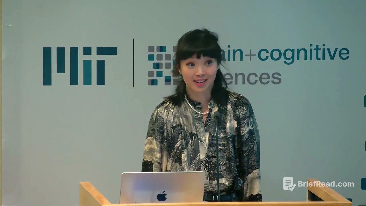
Josh Tenenbaum introduces Judy Fan as a creative researcher who has made significant contributions to cognitive science. Fan's work spans from basic perception to complex cognitive processes, including artistic expression, narrative, education, and learning. She maintains rigor in her approach to understanding how humans make sense of the world through symbols, data, and explanation, which is increasingly important in our current era.
Understanding Cognitive Tools [3:52]
Judy Fan defines cognitive tools using the number line as an example, emphasizing that these tools are human inventions that aid in thought and discovery. The creation of rectangular coordinates by René Descartes linked algebraic expressions with geometric curves, solving mathematical problems like doubling the volume of a cube. This revolutionary tool is now indispensable in mathematics education, combining symbolic and graphical notation to represent and manipulate mathematical objects. The question is how humans continually innovate such tools.
Leveraging Visual Abstraction to Communicate Concepts [13:00]
Humans began marking their environments 30,000 to 80,000 years ago, repurposing surfaces to carry meaning. The history of learning and discovery is intertwined with technologies that make the invisible visible, such as Darwin's finches illustrations, Galileo's telescope, Ramón y Cajal's drawings of the retina, and Feynman diagrams. These images leverage visual abstraction to communicate what we know about the world, highlighting relevant details. This understanding allows us to create new things, translating biological insights into bioengineering, physical theory into advanced instrumentation, neuroscience into medical devices, and quantum mechanics into modern electronics.
Fan presents a schematic illustrating cognitive psychology's traditional mode, enriched by social cognition, where learning and knowledge sharing resemble formal science. She argues that cognitive tools and engineering are critical missing ingredients. Her research aims to explain how we discover useful abstractions and apply them to create new things. She shares work on how people leverage visual abstraction to communicate semantic knowledge using freehand drawing.
Visual perception transforms sensory inputs into meaningful experiences, enabling visual production, which generates markings that leave a visible trace. Visual communication arranges graphical elements to inform, teach, persuade, or collaborate.
The presentation includes three studies. The first study addresses the perceptual basis for understanding what pictures represent, using drawings that look like real-world objects. Two dominant views are that drawings resemble objects or that they denote objects through convention. Earlier work showed that neural networks can generalize to sparse sketches, suggesting that pictorial meaning and resemblance can be resolved by building better models of visual processing. Recent work further tested this resemblance account by training a decoder to map sketch elements to photograph elements, constrained by spatial relationships.
A static account of visual processing fails to explain drawings that depend on context. The next goal was to incorporate context to account for a greater variety of graphical representations. A study paired people to play a drawing game, varying the objects in the display. People adjusted their drawings based on context, making more detailed drawings when needed and sparser drawings when possible. A computational model captured this behavior, showing that both visual abstraction and sensitivity to context are critical for communicating at the appropriate level of abstraction. Recent work pushed this idea further to understand how new graphical conventions emerge based on shared history.
People possess richer knowledge than just names and appearances. Visual abstraction transmits mechanistic knowledge about how things work. Holly Huey's study probed what people think should go into a diagram that illustrates how something works, differentiating it from an ordinary illustration. The cumulative hypothesis suggests explanations are augmented depictions, while the dissociable hypothesis suggests explanations emphasize mechanistic abstractions while de-emphasizing visual appearance.
The study characterized the content of visual explanations and compared them to visual depictions, measuring how well each helped viewers extract information. Participants produced explanations and depictions of novel contraptions with observable mechanisms. Results showed that people allocate more strokes to causal parts in explanations and emphasize background more in depictions. Explanations better communicated how mechanisms worked, but depictions were better for communicating object identity, consistent with the dissociable account. People share intuitions about what should go into a visual explanation, even when generating one for the first time, sacrificing visual fidelity to emphasize mechanistic information. Communicative context and goals are important for understanding why people draw the way they do.
The next section asks what it would take to develop artificial systems capable of human-like visual abstraction. The goal is to develop useful scientific models of visual communication. The development of experimental paradigms and data sets is prioritized to measure and characterize behaviors across a broader range of settings. The evaluation of machine learning systems is important to determine if they are promising candidates for capturing detailed patterns of human behavior in high-dimensional tasks.
The task setting takes inspiration from Picasso's bull drawings, which range from detailed to abstract. A scientific model of human visual abstraction should represent the ways in which these bulls are different and similar. A benchmark called SEVA was created to pose these challenges explicitly. 90,000 hand-drawn sketches were collected from 5,500 people of 128 visual concepts under varying production budgets.
The drawings were shown to people and 17 different vision algorithms. As people were given more time to make a detailed sketch, those sketches became more recognizable to models and people. While some models performed better on the recognition task, the variation across models was dwarfed by the gap between models and people. This suggests there is still a sizable human model gap in alignment to close for sketch understanding. CLIP-trained models outperformed the others, making it a reasonable candidate to explore generative models of sketch production built on top.
Even while human drawings and CLIPasso's drawings were similarly recognizable across the four production budgets, humans and CLIPasso sparsify their drawings differently. Humans and CLIPasso are functionally similar in terms of the set of meanings they convey. As the production budget tightens, much larger divergences are seen between people and CLIPasso. The SEVA benchmark will be a useful resource for others interested in developing models of human-like visual abstraction.
Harnessing Multimodel Abstraction to Support Statistical Reasoning [37:17]
The presentation transitions to multi-modal abstractions and how they support statistical reasoning. Observations about the world are rarely clean, and we infer underlying structure from data points. This inferential move is a fundamental building block of scientific reasoning, aided by technologies like data visualization. Plots help resolve parts of the world that you can't see directly, allowing you to see patterns that might be too large, noisy, or slow to see with our own eyes.
Unlike a drawing of Darwin's finches, it may not be obvious what you're looking at when you first see a data visualization. Once you learn how, it's a kind of superpower. Many individual observations can be distilled into a single graphic that tells a story. Developing the skills to read and interpret graphs has long been a goal of STEM education. Theories that explain how people use these images to discover and communicate quantitative insights will help equip people with quantitative data literacy skills.
Three directions are pursued in this vein. The first question asks about the underlying operations needed to understand plots. The strategy is to obtain machine learning systems that can handle questions about data visualizations, assess alignment with people, and then interrogate the source of any gaps. A way of measuring understanding is needed.
A benchmarking effort compared humans and AI systems on six commonly used tests of graph-based reasoning. The tests were administered in as parallel a manner as possible to both human participants and several multi-modal AI systems. The overall score achieved by humans and these models was recorded, as well as the full set of error patterns they produced.
Across all assessments, a meaningful gap was seen between models and humans. This is a gap that might have been missed had we relied exclusively on the chart understanding benchmarks that are currently most popular in the machine learning literature. Even though GPT 4 V might look to be approaching human level performance, none of these models, GPT 4 V included, generated human-like error patterns. VLMs remain exciting and promising testbeds for developing and parameterizing the hypothesis space of possible cognitive models of visualization understanding, but there are still systematic behavioral gaps that are worth interrogating further to realize those models' full potential.
In parallel, experimental paradigms have been developed to probe a related facet of visualization understanding, the ability to select the appropriate plot to address your epistemic goal. The way the problem is set up is to imagine that there's some question that you have about a data set. The agent is trying to pick the plot to help shift the person's beliefs appropriately, but if they had a different question in mind, maybe they might need a different plot.
A study formulated hundreds of different questions that could be answered by using real, publicly available data sets. Participants were presented with a menu of possible graphs that they might show someone else in order to help them answer that question. They could choose from this menu either a bar plot, line plot, or scatter plot. The frequency with which they picked each one was measured in order to construct a choice distribution over plots.
Various hypothetical strategies that people might have used to pick the plots that they did were tested. The best candidate was the proposal that people are sensitive to the features of those plots that were relevant for answering the question and, in fact, actually predicted the performance of about 1,700 other participants who tried answering every one of those questions when paired with every possible plot. This audience sensitive proposal did well across the board.
This is an initial validation of a strategy for measuring visualization understanding using more open ended tasks and also because it suggests that even non-experts are sensitive to those features of plots that make some suitable for answering some questions than others.
A critical look is taken at the problem of measurement. The question is what are these tests actually measuring, and are they measuring the skills in the best possible way? Initial steps are taken towards answering those questions. GGR and VLAT were given as a composite test to a large and diverse sample of US adults.
People who did well on one test often did well on the other, suggesting that maybe the two tests are measuring some of the same things or similar things. One possibility is that those two tests track how much easier some plots are to understand than others. Performance wasn't consistent for a given kind of plot within or across tests, and there weren't even enough items to be able to establish a direct link between the type of graph and performance.
The patterns of mistakes that people made were examined, and it was found that the best way to predict those patterns on these two tests wasn't the kind of plot or even the type of question. Other underlying factors that aren't well described by the ontology are really accounting for error patterns much more efficiently. A parsimonious four factor model does better than one that uses the groupings that you might think of to use to organize the set of skills needed to understand any graph.
Even if existing assessments might not be testing and characterizing visualization understanding in the best possible way, this is a call to action to develop improved measures. This work establishing the perceptual and cognitive foundations of data visualization is important because it will give us a chance to use what we learn to eventually help people, learners in real educational settings, calibrate their understanding of a complicated and changing world that we can ever only observe a part of.
Q&A [57:19]
The presenter wants to develop psychological theories that explain how people use the suite of cognitive technologies that we've inherited and continue to innovate on. She wants to understand why that toolkit looks the way it does, what future cognitive tools might work even better. Understanding how these tools work and how to make them better really matters because it's like these tools that are at the heart of two of our most impactful and generative activities. First, education, which is the institution and maybe more importantly the expectation that every generation of human learners should be able to stand on the shoulders of the last and see further and design the suite of activities and habits of mind that help people continually reimagine how the world could be better, and then go out and make it true.