TLDR;
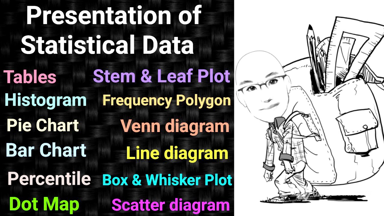
This video provides a detailed explanation of how to present statistical data using various methods such as tables, charts, and maps. It covers different types of tables (simple and frequency), charts (bar, pie, histogram, pictogram), and maps (dot and scatter). The video also discusses stem and leaf plots, tree diagrams, tiles, and percentile calculations. It emphasizes the importance of understanding these methods for both theoretical knowledge and practical application in fields like community medicine and epidemiology.
- Covers various methods for presenting statistical data.
- Explains different types of tables, charts, and maps.
- Discusses stem and leaf plots, tree diagrams, and percentile calculations.
- Emphasizes practical application in community medicine and epidemiology.
Introduction to Presentation of Statistical Data [0:02]
The video introduces the topic of presenting statistical data, emphasizing that notes and descriptions will be available for download. The discussion will cover various statistical data presentation methods, including those used in biostatistics, medical statistics, and health statistics. The presentation of statement data will include pictograms.
Types of Statistical Data and Presentation Methods [1:13]
The lecture explains how to present state data, depending on whether it is qualitative or quantitative. Qualitative data can be presented using bar charts, pie charts, spot maps, pictograms, or Venn diagrams. Continuous data can be presented using histograms, frequency polygons, Ogive curves, line charts, and scatter charts. The presenter reminds viewers of a previous video on data and variables, available on the channel's statistics playlist, to aid understanding.
Forms of Data Presentation: Tables, Charts, and Maps [3:24]
The presentation of data mainly takes three forms: tables, charts, and maps. Tables can be simple or frequency tables. Charts include bar charts, histograms, pie charts, and pictograms. Maps are of two types: dot maps and scatter diagrams. The presenter uses the mnemonic "His Pic at Pie Bar" to remember the four types of charts: Histogram, Pictogram, Pie chart, and Bar chart.
Types of Bar Charts: Simple, Multiple, and Proportional [6:44]
There are three types of bar charts: simple, multiple, and proportional. Multiple bar charts are also known as compound bar charts, and proportional bar charts are also called component bar charts. Histograms relate to frequency polygons and frequency curves. Other chart types include line charts (or line graphs/diagrams) and Ogive curves (or frequency diagrams).
Tables: Simple and Frequency Tables [9:03]
The discussion begins with tabulation, emphasizing the importance of tables in articles, magazines, and books. A complete table includes a table number, title, column headings, and row headings. Data should be written in a logical order, either by size or alphabetically. Footnotes should be included to describe any specific details or exceptions in the data.
Simple Tables: Definition and Examples [11:51]
Simple tables are exemplified by presenting the number of postgraduate (PG) students admitted to a Community Medicine department in different years. The table includes the year and the number of PG students admitted. Footnotes can be added to explain any anomalies, such as years with no admissions due to specific circumstances like NEET PG exam issues or lapsed seats. Examples also include census data showing India's population in different years.
Frequency Tables: Class Intervals and Distribution [14:35]
Frequency tables involve splitting data into class intervals to show frequency distribution. A key rule is to have a maximum of 20 and a minimum of five groups, with equal class intervals. An example is provided, showing the age distribution of PG students in a Community Medicine department, with class intervals of five years (e.g., 20-25, 25-30 years).
Charts: Bar Charts, Histograms, Pie Charts, and Pictograms [19:06]
Charts are used to compare magnitudes, especially for discrete data. The presenter uses the mnemonic "His Pic at Pie Bar" to remember the four types of charts: Histogram, Pictogram, Pie chart, and Bar chart. Bar charts use rectangles to present data and come in three types: simple, multiple, and proportional.
Simple Bar Charts: Vertical and Horizontal [21:45]
Simple bar charts can be vertical or horizontal, with bars separated by a small distance. An example shows PG admissions in different years, displayed graphically. The presenter notes that simple bar charts are useful for comparing frequencies, as seen in cricket match analyses showing runs scored by a batter over different years or overs bowled by a bowler.
Multiple Bar Charts: Compound Bar Charts [28:02]
Multiple bar charts, also known as compound bar charts, are used when there are two or more variables. For example, PG admissions data can be divided into male and female students. Each year shows bars for both male and female admissions, grouped together. The presenter emphasizes that multiple bar charts have gaps between the groups of bars, unlike histograms.
Proportional Bar Charts: Component Bar Charts [31:52]
Proportional bar charts, or component bar charts, divide a single bar into two or more parts to show proportions. For example, a bar representing total PG admissions in a year can be divided to show the proportion of male and female students using different colors or shading.
Histograms: Continuous Quantitative Data [34:25]
Histograms are used for continuous quantitative data and consist of a series of blocks. The horizontal axis shows the class interval, while the vertical axis represents frequency. The presenter provides an example using the age distribution of PG students, with continuous blocks representing age ranges and their corresponding frequencies. The key difference from bar charts is that histograms have no gaps between the blocks.
Frequency Polygons and Curves [40:18]
A frequency polygon is created by connecting the midpoints of the tops of the histogram blocks. A frequency curve is similar but forms a curve instead of angles, typically when there are many observations and reduced group intervals.
Line Charts: Frequency and Time Relationship [43:51]
Line charts are a special type of frequency polygon, mainly used to show the relationship between frequency and time. They are useful for illustrating trends, such as the incidence of a disease over a period.
Ogive Curves: Cumulative Frequency [47:30]
Ogive curves, also known as cumulative frequency curves, are used to determine cut-off limits and estimate the median. They involve plotting cumulative frequencies and finding the point where two curves meet, then projecting that point onto the horizontal axis to find the median.
Pie Charts: Qualitative Data Representation [48:45]
Pie charts explain the qualitative nature of discrete data by comparing different segments of a circle. It is important to show percentages for each segment, with the total circle representing 100% (360 degrees). The presenter suggests that bar charts are superior to pie charts for data display. An example shows the proportion of male and female PG students using a pie chart.
Venn Diagrams: Overlapping Qualitative Data [52:04]
Venn diagrams are used when there is overlapping of qualitative data. An example illustrates the fields that postgraduate students in Community Medicine can pursue, such as research, administration, and academics. Overlapping sections show students interested in multiple fields.
Pictograms: Presenting Data to the Common Man [55:47]
Pictograms are used to present data in a way that is easily understandable to the general public. Examples include using images to represent population sizes of different countries or showing the hierarchy of healthcare facilities (sub-center, primary health center, community health center) with corresponding staff.
State Maps: Shaded and Dot Density Maps [59:58]
State maps include shaded maps and dot density maps. Shaded maps use shading to show the distribution of diseases in different geographical areas. Dot density maps use dots to represent cases, as exemplified by John Snow's map of cholera cases in London.
John Snow's Cholera Map: A Historical Example [1:00:38]
John Snow, known as the Father of Epidemiology, used a spot map to identify the source of a cholera outbreak in London in 1854. By mapping the cases, he found that most victims lived near a specific hand pump on Broad Street. His investigation revealed that the pump was contaminated by a nearby cesspool, leading to the outbreak. Removing the pump handle stopped the epidemic.
Scatter Diagrams: Relationship Between Variables [1:09:12]
Scatter diagrams are used to describe the relationship between two quantitative variables. The vertical axis represents the dependent or outcome variable, while the horizontal axis represents the independent variable. A cluster of points around a line indicates a good linear relationship, while scattered points indicate a poor relationship.
Stem and Leaf Plots: Organizing Data [1:11:22]
Stem and leaf plots are used to organize data, with the "stem" representing the tens digit and the "leaves" representing the ones digit. An example shows test scores of children, organized to display the distribution of scores.
Tree Diagrams: Possible Outcomes and Events [1:17:11]
Tree diagrams are used to illustrate possible outcomes or events. An example shows a doctor using a tree diagram to assess joint evolution in diabetic patients, with branches representing different joints and their conditions.
Tiles: Quartiles, Quintiles, Deciles, and Percentiles [1:18:12]
Tiles involve dividing data into equal parts, such as tertiles (three parts), quartiles (four parts), quintiles (five parts), deciles (ten parts), and percentiles (100 parts). The presenter explains how to calculate the number of intercepts needed for each type of tile.
Box and Whisker Plots: Quartiles and Data Distribution [1:20:31]
Box and whisker plots present quartiles and data distribution. The box represents the interquartile range (IQR), and the whiskers extend to the minimum and maximum values. The box contains 50% of the data, with 25% in each whisker.
Percentiles: Health and Growth Charts [1:22:33]
Percentiles are commonly used in health and community medicine, particularly in growth charts. The median is the 50th percentile. The presenter provides a formula for calculating percentiles and demonstrates its application with an example involving student exam scores.
Key Takeaways and Exam Preparation [1:29:10]
The presenter summarizes key points for exam preparation, including understanding the names and uses of different data presentation methods. Specific emphasis is placed on understanding line charts, pie charts, Venn diagrams, shaded maps, scatter diagrams, tiles, and percentiles. The presenter also highlights potential MCQ topics and image-based questions.