TLDR;
This video provides a first look at Apple's new "Liquid Glass" design in iPad OS 26, comparing it to iPad OS 18. The author examines changes to icons, widgets, app interfaces, and Control Center, and accessibility features like "Reduce Transparency" and "Increase Contrast". The author remains undecided on whether the changes are an improvement, noting some elements are harder to see while others offer potential benefits.
- Icon and Widget Customization
- App Interface Changes
- Control Center and Accessibility
- Overall Impression
Introduction [0:19]
The author shares his initial experiences with the developer beta of iPad OS 26, focusing on the new "Liquid Glass" design. He notes that this is his third video on iPad OS 26 due to the significant number of changes, which aim to make the iPad more like a computer for productivity. The author expresses some reservations about the new look, remaining undecided on whether it's an improvement. He explains that Apple is renaming its operating systems to reflect the year of primary use, similar to car models.
Home Screen Comparison [2:29]
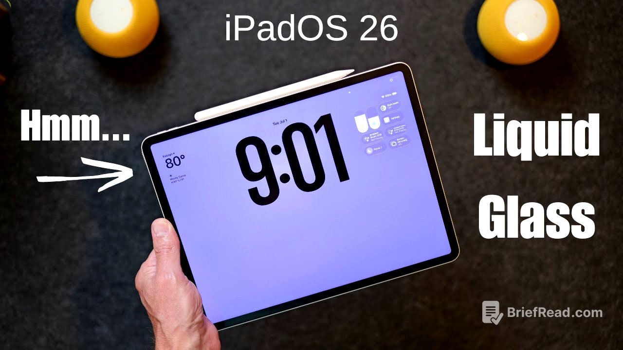
The author compares the home screens of iPad OS 18 and iPad OS 26 side-by-side, noting differences in icon sizes even when set to "large." The "edit" icon has a see-through look in Liquid Glass with a perimeter, while the older version has a gray background. The edit menu in iPad OS 26 includes options to "add widget," "customize," and "edit pages," with the addition of "edit wallpaper." Customization options include light, dark, and clear icon styles, with the ability to set dark mode to "always" or "auto." The dock in iPad OS 26 has a more transparent background with a shimmer of glass.
App Interface Changes [7:22]
The author compares various app interfaces in iPad OS 18 and iPad OS 26. In the Calendar app, iPad OS 26 features rounded corners around the day, week, month, and year options, while iPad OS 18 has more squared-off corners. The icons are white in the new version, compared to red in the old version. In Apple Notes, the new version has white icons and rounded corners. Safari appears mostly the same, with slight differences in colors and layout. In the Photos app, iPad OS 26 displays photos in full screen with other photos laid on top, while iPad OS 18 makes room at the bottom. The edit and share icons are located at the top in iPad OS 26, compared to the bottom in iPad OS 18.
Control Center and Accessibility [9:47]
The author finds the new Control Center in iPad OS 26 harder to see due to the tinted background, which reflects the colors beneath it. Apple has attempted to address this in the latest beta by adding a "Reduce Transparency" option in settings under accessibility and display & text size. Additionally, the "Increase Contrast" feature adds lines around various elements on the screen in iPad OS 26, while in iPad OS 18, it simply increases the contrast without adding lines.
Final Thoughts [12:16]
The author concludes that while iPad OS 26 is still in development, Apple is trying to bring freshness to the iPad with a new design language. However, he remains skeptical about whether the changes are beneficial. He encourages viewers to share their thoughts in the comments, emphasizing that it's still early in the release cycle.