TLDR;
This video provides a comprehensive guide on creating killer YouTube thumbnails that can help boost your channel's growth. The video emphasizes the importance of time allocation, understanding the psychology behind clicks, and mastering the design elements of a thumbnail. It also highlights the significance of analyzing your thumbnail's effectiveness and creating variations to optimize its performance.
- Time Allocation: Dedicate significant time to crafting your thumbnail, prioritizing it over other aspects of video production.
- Psychology of Clicks: Understand the concept of "curiosity gaps" and how to create them using different methods like moment, story, result, transformation, and novelty thumbnails.
- Design Elements: Master the three C's of thumbnail design: contents, composition, and contrast.
- Analysis and Variations: Run your thumbnails through clarity, contrast, and glance tests to ensure their effectiveness. Create multiple variations to optimize performance.
Intro [0:00]
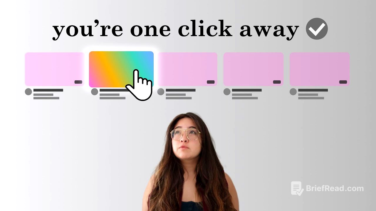
This video aims to teach viewers how to create effective YouTube thumbnails that can significantly impact their channel's success. The video emphasizes that a well-designed thumbnail can be the difference between a video going viral or being completely overlooked. The video outlines a four-part formula for creating killer thumbnails, which will be explored in detail throughout the video.
Part 1: Killer Time Allocation [0:34]
The first part of the formula focuses on the importance of dedicating sufficient time to crafting your thumbnail. The video argues that top YouTubers prioritize thumbnail creation, viewing it as a crucial element in driving clicks and watch time. It encourages viewers to spend days or even weeks perfecting their thumbnails, emphasizing that the time invested is worth it for the potential impact on video performance.
Part 2: Killer Psychology [1:55]
The second part delves into the psychology behind clicks, highlighting the role of curiosity in driving viewer engagement. The video introduces the concept of "curiosity gaps," which are the gaps between what viewers know and what they want to know. It explains that these gaps are powerful motivators for clicks, as viewers are naturally driven to seek closure. The video then explores five methods for creating curiosity gaps: moment thumbnails, story thumbnails, result thumbnails, transformation thumbnails, and novelty thumbnails.
Curiosity Gaps [3:00]
This section provides detailed explanations of each method for creating curiosity gaps, using examples from popular YouTubers.
- Moment Thumbnails: These thumbnails capture a specific moment before a powerful reaction, leaving viewers wanting to know what led up to that moment and what happens next.
- Story Thumbnails: These thumbnails focus on building narrative tension, introducing a question or point of tension that sets up the first act of the story. Viewers are drawn to the resolution of the tension and the potential consequences that follow.
- Result Thumbnails: These thumbnails showcase a desired result, whether it's a physical product or a skill. They create curiosity by prompting viewers to wonder how the result was achieved and if they can achieve it themselves.
- Transformation Thumbnails: These thumbnails feature a desired result and also show a beginning state. They are effective because viewers are drawn to the story and process of getting from point A to point B.
- Novelty Thumbnails: These thumbnails leverage our natural urge to experience something new. They can be awe-inspiring or weird and unexpected, often combining novelty with familiar elements for a unique twist.
Scroll Stoppers [6:58]
This section focuses on "scroll stoppers," which are elements that can grab viewers' attention and prevent them from scrolling past your thumbnail. The video explains that our brains are constantly bombarded with stimuli and use attention mechanisms to filter out irrelevant information. However, these mechanisms can be hacked by using elements that our brains are biologically primed to pay attention to.
- Faces: Faces are powerful scroll stoppers because our brains are good at recognizing them and understanding emotions. However, familiarity bias plays a role, making faces more effective for established YouTubers.
- Numbers: Large, round numbers, especially when associated with money, are highly clickable.
- Danger and Movement: Our brains are wired to detect danger and movement, making these elements effective scroll stoppers.
- Emotion: Displays of emotion can signal a threat or opportunity, drawing our attention.
- Bright Colors: Bright colors can be eye-catching, as they were important for identifying things like ripening fruit or fresh blood in the past.
- Aesthetically Pleasing Elements: Our brains are drawn to things that are aesthetically pleasing, as they provide a pleasurable experience.
The video cautions against overloading thumbnails with too many scroll stoppers, as it can dilute your brand and make your thumbnail appear clickbaity. It encourages viewers to choose one or two scroll stoppers that enhance their chosen curiosity gap and brand.
Part 3: Killer Design [11:56]
The third part of the formula focuses on the design elements of a thumbnail, emphasizing the importance of clarity and ease of processing. The video introduces the three C's of thumbnail design: contents, composition, and contrast.
Contents [12:47]
This section focuses on the visual elements that make up your thumbnail, including people, icons, graphics, backgrounds, and text. The video emphasizes that the contents should be chosen to create your chosen curiosity gap. It categorizes these elements into main characters and supporting characters. The main character is the single element that best contributes to the curiosity gap, while supporting characters provide context, draw attention, or add additional curiosity.
Composition [14:29]
This section focuses on the arrangement of elements within your thumbnail, highlighting the importance of layout and hierarchy. The video explains that most high-performing thumbnails follow either symmetrical or asymmetrical alignments. Symmetrical thumbnails place the main character in the center, while asymmetrical thumbnails follow the rule of thirds, placing the main character on the left or right third of the thumbnail. The video also emphasizes the role of supporting characters and backgrounds in directing attention, using examples of leading lines and arrows to guide the viewer's eye.
Contrast [17:58]
This section focuses on the use of contrast to capture attention and guide the viewer's eye. The video explains that contrast can be created using color values, including hue, saturation, and luminosity.
- Luminosity Contrast: This type of contrast is created by mixing lights and darks. It is effective for making elements stand out against a contrasting background.
- Saturation Contrast: This type of contrast is created by mixing areas of high saturation with areas of low saturation. It is effective for making elements pop against a less saturated background.
- Hue Contrast: This type of contrast is created by using complementary colors, which sit opposite each other on the color wheel. It is effective for creating a strong visual impact.
The video also emphasizes the importance of contrast in relation to other thumbnails that viewers might see, encouraging viewers to consider going against the grain and using unique color schemes or design styles to stand out.
Part 4: Killer Analysis [23:15]
The fourth and final part of the formula focuses on analyzing the effectiveness of your thumbnail and making adjustments as needed. The video outlines three tests that top YouTubers use to evaluate their thumbnails: the clarity test, the contrast test, and the glance test.
Wait... [25:33]
This section introduces the concept of thumbnail variations, emphasizing that even the best YouTubers are not always right. It explains that top YouTubers create three thumbnails: the one they initially publish and two variations that they are ready to swap in if the initial thumbnail underperforms.
Variations [25:48]
This section provides detailed information on creating thumbnail variations. The video explains that variations should not be simple changes like color adjustments. Instead, they should involve going back to the beginning and considering different curiosity gaps, scroll stoppers, elements, compositions, and types of contrast. The video encourages viewers to create 10 to 15 different thumbnail concepts, even if they are just sketches, to get a general idea of what the final product could look like.
Some Encouragement [28:08]
This section concludes the video with a message of encouragement, reminding viewers that creating effective thumbnails is an art form, not an exact science. The video emphasizes that the guidelines provided are just that: guidelines. It encourages viewers to experiment and find their own style, while always keeping the principles covered in the video in mind. The video concludes by emphasizing that consistent effort and improvement will lead to success, and that a killer thumbnail is just one step towards creating a killer video.