TLDR;
This video provides a detailed demonstration of flourishing lowercase letters W, X, Y, and Z in calligraphy. It covers basic forms, variations, and flourishing techniques, emphasizing the importance of ovals, slant, and consistent spacing. The instructor shares tips on pen grip, ink management, and how to apply these techniques to create elegant and balanced letterforms.
- Demonstrates flourishing techniques for lowercase letters W, X, Y, and Z.
- Emphasizes the importance of ovals, slant, and consistent spacing in calligraphy.
- Provides tips on pen grip, ink management, and creating elegant letterforms.
Introduction [0:14]
The instructor welcomes viewers to the calligraphy demonstration, focusing on flourishing lowercase letters W, X, Y, and Z. She mentions upcoming calligraphy workshops and introduces the practice sheets available for download on her website, shop.kalomakeart.com. She also highlights the newly released copy sheets for classic-style capital letters in engrosser script.
Materials and Setup [2:50]
The instructor uses a micro sells pen holder, a Leonardo EF principal nib, and Wanna Ink for the demonstration. She shares a tip for managing low ink levels by using blue tack to slant the ink container, making it easier to dip the pen. She also mentions using blue tack to secure the ink while practicing calligraphy on airplanes.
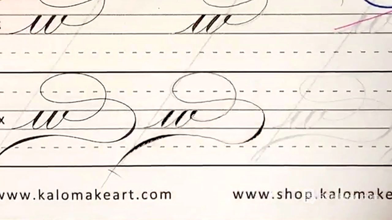
Letter W [4:36]
The basic W is formed with two under turns, starting with an entrance stroke, pressing down, lifting, and coming up. The exit should form an oval shape. The instructor emphasizes maintaining parallel spacing and ensuring the left and right sides of the letter have equal space. She also points out the ovals within the W shape and the importance of perpendicular intersections when lines overlap, avoiding "shade on shade."
Flourishing Techniques for W [11:35]
The instructor demonstrates various flourishing techniques for the letter W, including heart-shaped flourishes and extending the exit stroke. She reminds viewers that these techniques can also be applied to other letters like A, E, I, O, U, M, and N. She highlights the importance of maintaining parallel spacing, referring to it as "train track" spacing.
Advanced W Flourishes and Oval Dissection [14:13]
The instructor demonstrates more complex W flourishes, emphasizing gradation of thickness and pressure control using the index finger. She introduces the concept of the "line of universal beauty" or S-curve, noting the implied oval within the curve. She also discusses dissecting ovals to find their axes and apexes, which helps determine where to add shading. She recommends studying exemplars from books like the Tamblyn book to train the eye.
Letter X [26:27]
The instructor begins with the basic form of the letter X, which involves a thin hairline going up and a pressure stroke coming out like a reverse C. She advises against pressing too hard to avoid ink explosions. She then demonstrates flourishing techniques, emphasizing perpendicular crossings and continuous hand movement to create oval forms.
X Flourishes and Retouching [33:31]
The instructor continues demonstrating various X flourishes, focusing on gradation of pressure and thickness. She explains how to retouch or touch up areas by adding a hairline to sharpen the lines. She notes that Wanna Ink's transparency can sometimes make retouching visible, and suggests using Sumi ink for less obvious touch-ups.
Alternative X Styles [37:06]
The instructor presents alternative styles for the letter X, including one with a heavier base and top. She emphasizes adding pressure at the midway point and maintaining perpendicular crossings.
Letter Y [41:27]
The instructor discusses two methods for writing the basic letter Y: one with a compound curve followed by a descender (like a J), and another resembling an upside-down H. She prefers using a soft S-curve for flourishing, as it appears more elegant. She emphasizes maintaining consistent distance and perpendicular intersections.
Y Flourishes and Descenders [47:41]
The instructor demonstrates various Y flourishes, including bringing the stroke higher and swinging it out with an S-curve. She advises being light when crossing lines to avoid pulling the ink. She also shows how these techniques can be applied to other descenders like J and G. She notes that the Y flourish can be used upside down for flourishing the letter H.