TLDR;
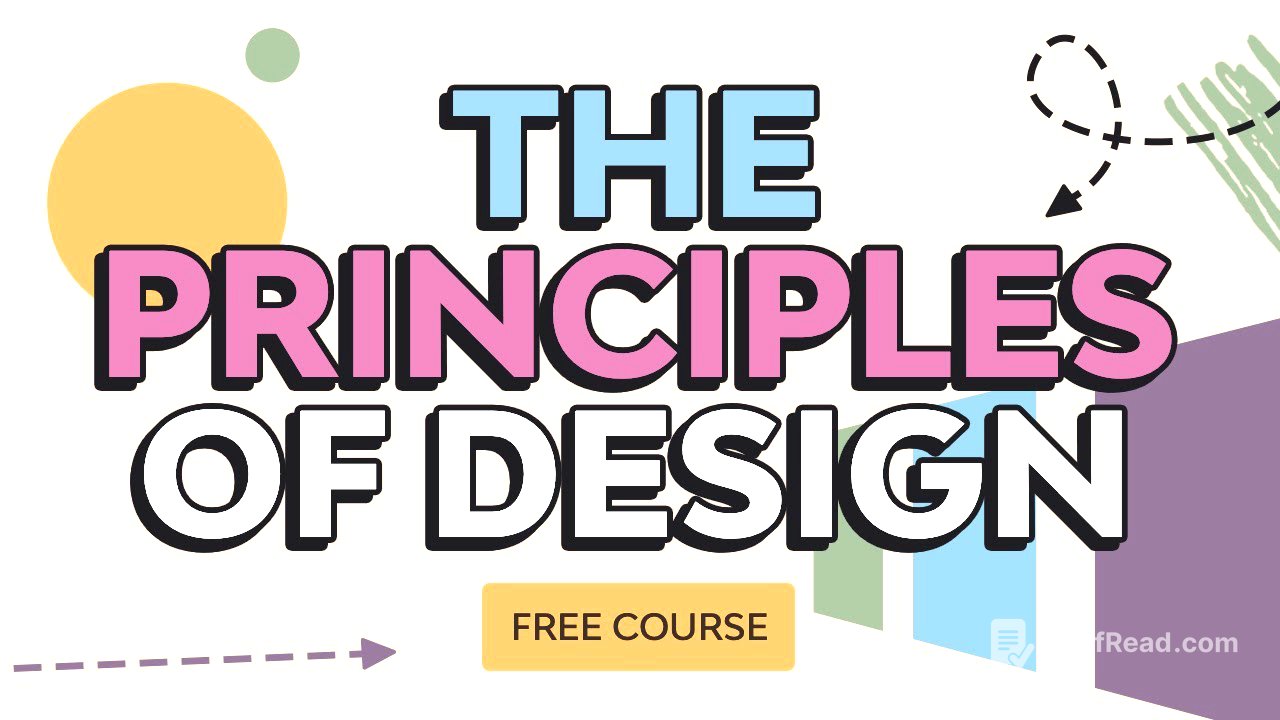
This video provides an overview of the fundamental principles of design, explaining how they contribute to visually appealing and functional compositions. It uses real-world examples and templates from Envato Elements to illustrate each principle. The key principles covered include balance, unity, contrast, emphasis, repetition, pattern, rhythm, movement, proportion, harmony, and variety. Understanding and applying these principles enables designers to create effective and purposeful designs.
- Balance ensures stability and visual weight in a design.
- Unity creates harmony and natural relationships between elements.
- Contrast establishes visual hierarchies and focal points.
- Emphasis directs the viewer's attention to specific elements.
- Repetition creates consistency through recurring elements.
- Pattern enhances the viewer's experience with multiple repeating elements.
- Rhythm adds organised movement through varied repetition.
- Movement guides the viewer's eye through the composition.
- Proportion ensures elements relate well to each other, adding balance and harmony.
- Harmony creates cohesiveness between elements through related styles.
- Variety adds contrast and tension to make the design intriguing.
Introduction [0:00]
Laura Kyung, a graphic designer with over 15 years of experience, introduces a course on the principles of design. These principles are a set of rules that designers use to create visually pleasing, organised, and functional work. The course will use real-life examples and templates from Envato Elements to explain these principles, highlighting that understanding these rules allows designers to break them effectively.
Balance [0:52]
Balance creates stability in a design by ensuring every element carries visual weight through scale, shape, colour, and texture. A lack of balance can make a design appear as if it's falling to one side. Symmetrical balance, where elements are equally distributed on either side of a vertical line, is a basic form of balance. Even when elements are off-centre, balance can be achieved by counteracting visual weight with other elements, such as using a larger typeface on one side to offset an object on the other.
Unit [2:33]
Unity is the harmony produced by all elements in a design, creating a natural relationship between them. In museum design, unity can be achieved even with loud and creative elements by ensuring a relationship between pictures and typography. A specific colour palette and related illustration styles also contribute to unity. A lack of unity can make a design feel disorganised, so it's important that unity guides the viewer to the right information.
Contrast [4:15]
Contrast refers to the level of difference between design elements, creating visual hierarchies that guide the viewer to certain elements. This can be achieved through different colours, shapes, and textures. For example, using yellow and purple together can make a poster stand out. Different typefaces, such as sans serif and slab serif fonts, and contrasting shapes like circles and blocks, also create contrast. In magazine design, contrast is important for creating hierarchy, helping readers identify the most important elements.
Emphasis [6:13]
Emphasis is a strategy used to draw the viewer's attention to a specific design element, often achieved through colour, lines, and positive/negative space relationships. Contrast is key to creating emphasis. Breaking the repetition of elements, such as changing the colour of one head among many, can create emphasis. Leading lines, like multiple lines pointing to a pineapple, also guide the viewer to the key element in the design. A lack of emphasis can make a design look dull, so it's important to capture the viewer's attention.
Replay [7:43]
Repetition involves repeating the same element throughout a design to create consistency. This can be the same typeface, graphic element, or grid. In a minimalist poster, a leaf-like shape is repeated four times in different colours to create an interesting effect. In brand design, repeating elements like a yellow wavy shape on a letterhead, envelopes, and a sketchbook create consistency and cohesiveness, making the brand look put together.
Pattern [8:53]
Pattern is the repetition of multiple design elements to enhance the viewer's experience. Unlike repetition, which focuses on a single element, pattern involves multiple elements expanding throughout the design. When using patterns, it's important to avoid creating a clumpy or disorganised design. For example, a poster with intricate waves in the background keeps the text simple to avoid overwhelming the viewer. In brand design, patterns extend the graphic line, such as using a simple elephant icon on a business card to create a strong and impactful visual.
Rhythm [10:43]
Rhythm is the visual tempo created by a combination of elements used repeatedly throughout a design with variation, creating organised movement. It's often subtle but makes a significant difference. For example, a design with coloured blocks of varying sizes creates rhythm without a clear system. In a flyer, triangle elements of different sizes and colours add movement, making the design more exciting for a concert.
Movement [12:15]
Movement refers to the path the eyes take through a design composition. A dynamic composition leads the eyes from one element to another, guiding viewers to the most important element. For example, a poster with a motorcycle image leads the eyes from the wheel to the kit on the opposite side, counteracted by simple text at the top. Organic shapes, like branches, add movement, while stable elements, like underlined information, ground the poster.
Proportion [14:09]
Proportion is the sense of unity created when all design elements relate well to each other, adding balance and harmony. This involves ensuring the main information is large and clear, while supporting information is smaller. For example, a poster places the subject's name at the centre with supporting elements on the sides. In magazine design, the main title is larger, while body copy and quotes are different sizes to create a visual hierarchy. Without proportion, everything would look the same, and viewers wouldn't know which information is most important.
Harmony [15:53]
Harmony is the sense of cohesiveness between elements in a design composition. Elements shouldn't be identical but should be related through colour palettes, typefaces, or styles. For example, a book cover uses sans serif text in the background with handwritten text details that are related but not the same. Similarly, organic arrows, circles, and scribbles add personality while contrasting the background. A CD cover features pastel colours that work well together, with geometric shapes contrasting an organic image.
Variety [17:58]
Variety creates contrast and tension in a design composition, making it intriguing for viewers. Mixing organic and geometric shapes can work well if it enhances the design's theme. For example, a poster uses different typefaces, breaking up a rigid grid with an image and handwriting. A sans serif text block is contrasted by a handwriting font and a dynamic image on an angle. A design with different colours and typefaces adds variety through how each compartment is used, with enough repetition to show they belong together but enough variety to keep them distinct.
Conclusion [19:58]
The principles of design are the foundation for creating a strong and well-presented composition. They help understand how other designs are built and identify missing elements in your own designs. Using these principles helps design with purpose, giving function to every element and communicating a clear message. Envato Elements offers creative templates, photographs, and fonts for design projects.