TLDR;
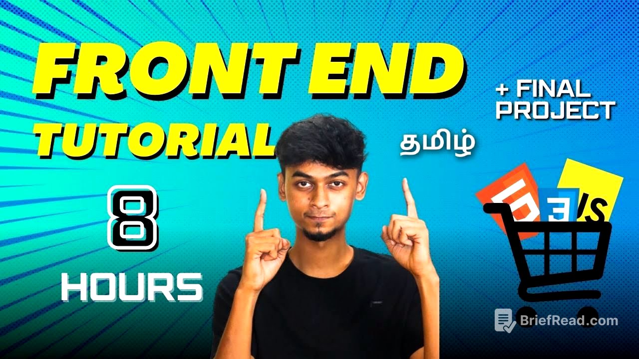
This video serves as a comprehensive guide to web development, covering HTML, CSS, and JavaScript. It includes practical examples and project showcases to illustrate key concepts.
- HTML basics, covering tags, lists, tables and forms.
- CSS fundamentals, including styling, box model, display properties and navigation bars.
- JavaScript essentials, such as variables, functions, DOM manipulation and event handling.
Introduction [0:00]
The video introduces a web development tutorial focusing on HTML, CSS and JavaScript. It mentions building an event page and other projects to teach the fundamentals.
HTML Basics [0:18]
This section covers the basics of HTML, explaining that it stands for Hypertext Markup Language and is the building block of web pages. It details how HTML uses tags to control the formatting and structure of a document, demonstrating various heading tags (H1 to H6), paragraph tags, and horizontal rule (HR) tags. The tutorial also covers anchor tags for creating hyperlinks, image tags for embedding images, and different types of lists (ordered and unordered).
CSS Fundamentals [1:07:37]
The video transitions to CSS, explaining that it is used to style and format web pages created with HTML. It covers inline, internal and external CSS, demonstrating how to change text colour, background colour and font properties. The box model, including padding, margins and borders, is also explained. The tutorial also covers the display property, including block, inline and inline-block values.
CSS Positioning [2:11:28]
This section introduces CSS positioning, covering the five main types: static, relative, absolute, fixed and sticky. It explains how each type affects the placement of elements on a web page, with practical examples.
CSS Flexbox [2:25:36]
The video explains CSS Flexbox, a layout model for arranging elements in a container. It covers properties like flex-direction, flex-items and justify-content, demonstrating how to align and distribute space between items. The tutorial includes examples of creating image galleries and responsive layouts using Flexbox.
Media Queries [2:55:19]
This section covers media queries, a CSS technique for applying different styles based on the screen size or device characteristics. It explains how to use max-width and min-width to create responsive designs that adapt to various screen sizes. The tutorial includes examples of changing background colours and element layouts based on media queries. The importance of the meta viewport tag for controlling layout on different devices is highlighted.
JavaScript Essentials [3:19:42]
The video introduces JavaScript, describing it as a popular programming language used to create interactive and dynamic web pages. It covers variables (var, let, const), data types (primitive and non-primitive), functions, and operators. The tutorial includes examples of DOM (Document Object Model) manipulation, event handling, and creating random numbers. It also covers conditional statements (if, else) and loops (for loop).
E-Commerce Project Showcase [7:54:07]
The video concludes with a showcase of an e-commerce project, demonstrating the practical application of HTML, CSS and JavaScript. It covers creating a navigation bar, product listings, and a contact page. The tutorial includes examples of responsive design using media queries and dynamic content updates using JavaScript.